
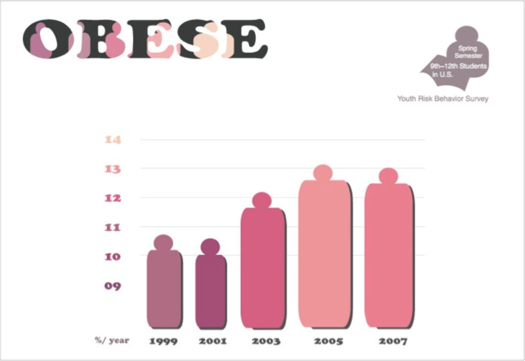
I adapt the notion of expanding and contracting colors.
I decided to use the pale red color in the middle (12% / 2003).
I added brightness and yellow slightly when percentage is increasing
to present the idea of using expanding colors on higher percentage.
I add darkness and blue slightly when percentage is decreasing because blue is a contracting color.
I want to intensify percentage changes by controlling colors.
The changes are also represented by another important factor of design, shape.
I use rounded-rectangular shapes (bars) with circles on top of them,
so they look like people. Rectangles are associated with dullness and massiveness,
and I chose rounded-rectangles as a representative shapes of overweight and obese people.
Smaller and thinner rectangles with darker and purple colors show smaller percentages,
and bigger and fatter rectangles with lighter and orange pink colors show higher percentages of obese people.