
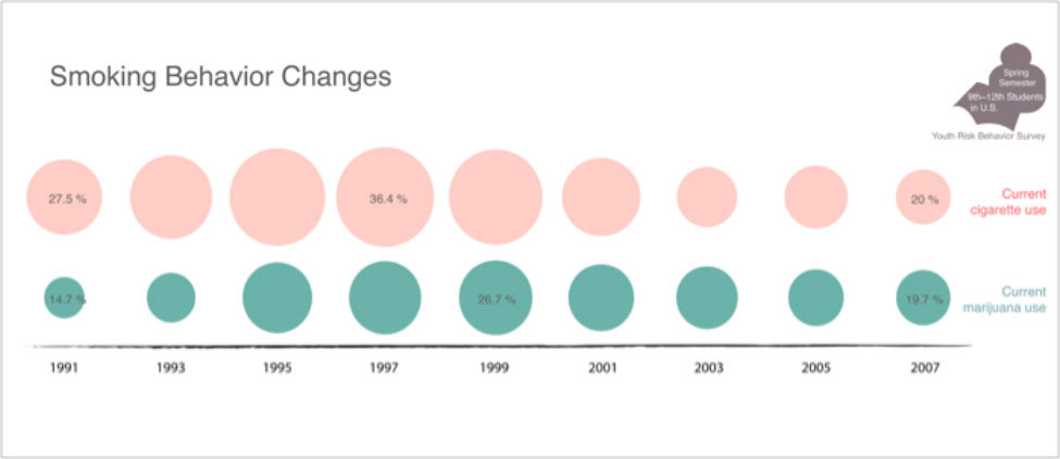
I used near opposite colors in two visualizations, Smoking Behavior Changes and 11 Selected Risk Behaviors.
Red and green sit opposite each other on the color wheel,
and I picked pale red and pale bluish green colors to compare the increase and decrease patterns of two data:
Current cigarette use and Current marijuana use from 1991 to 2007.
I can ask, “What is the cause of the decrease after 1997 and 1999 in both data,
Current cigarette Use and Current Marijuana Use?”
I believe that questioning the cause and effect of the data changes
and producing new research questions is a new start point of another visualization.